Chalky Organic Whites
Chalky Organic Whites

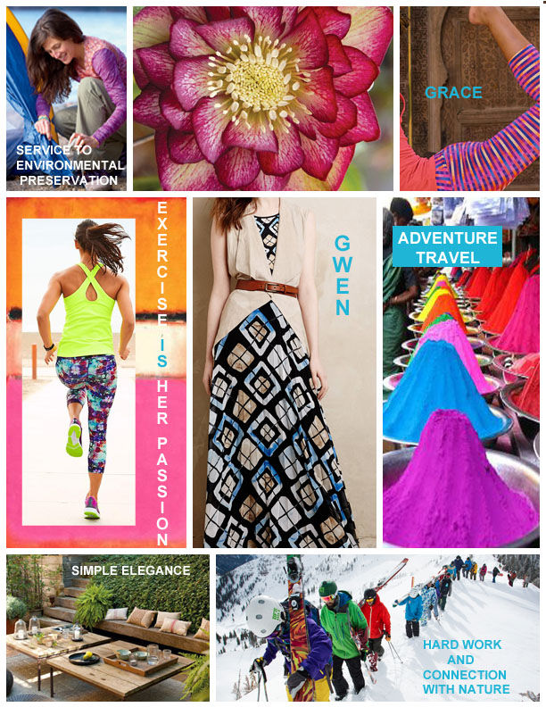
What can we as Designers and Manufacturers do to be more environmental friendly?
We are in an era of environmental awareness and the consumers are becoming more and more interested in products that are eco-friendly.
Since our industry is consumer driven we need to listen to the consumers opinions and where they are spending their dollars. Does your company’s mission statement include this type of customer? If so, what are you doing collectively to support environmental awareness in our production process?
The topic of the environmental impact of our industry seems so daunting but there are things we can do to help! In my attempt to wrap my brain around the environmental impact of our industry and learn more, I have a bi-monthly blog post about this issue.
Here are some clear ideas to keep in mind:
“Like any industrial process, textile printing requires raw materials, consumes energy and produces waste. Nonetheless, there is considerable scope for reducing the impact of the process and helping ensure it is carried out in a more responsible and sustainable way.”
-Joost Smits, Managing Director Textile at Stork Prints and his colleague, Consumables Manager Geert Klaassen.
click here to read more: spgprints.com
I love playing with resists, applying them on fabric, paper, leather, metal, you name it!
The first resist I used was wax, in the form of batik. Tjaunting tools, brushes, and stamps were in my applicator arsenal.
For paper application I use a liquid resist and apply it in a variety of ways; brush, pen, and tip.
It is imperfect and beautiful! The artwork comes to life when color is added.
When the resist is removed the magic happens! It is an experimental process, some times the results are amazing and sometimes, let’s just say it’s a “learning” moment. Either way the process is inspiring!
Jenndigo?
I am frequently asked how I came up with Jenndigo as a name for my design business. It’s a name that came to me on a road trip, trying to sum up my passion for textile design.
I fell in love with Indigo in my high school art class. Inspired by all types of art, I dabbled in classes ranging from drawing to weaving to batik. In batik class I was introduced to the magic of Indigo. Eventually I became in charge of setting up the dye Vats. This is where I really got an intimate exposure to the complexity of Indigo. I love the smell of the pigment as it dissolves in the water, the way the different hues appear and swirl around until they blend together. Even the froth on the top of the vat sparkles with pigment. Each color had it’s own beauty, but the Indigo dye vat struck a chord with me. So much so, I named my first-born child, Indigo.
When it came time to actually put a name to my design work, I came up with Jenndigo. A name that is the essence of me and my passion, Jennie and Indigo.

The Jewel of Inks”
“La Perle des Encre“s”
Herbin is the oldest name in pen inks in the world. They use all natural dyes in their inks. Here is a brief tidbit on how the inks were started:
When Herbin sailed to India he was inspired to create wax for sealing envelopes. He produced wax that made him famous throughout the kingdom. He then started creating inks. His inks were used by Louis XIV and by the author, Victor Hugo, who wrote the Hunchback of Notre Dame and Les Miserables. “ He began making pen inks in shop in Paris in 1700–beginning with the “Ink of Ships” and the “Jewel of Inks.”
I love love love these Inks! I love the way the pigment absorbs into the paper, sometimes there is a sparkle to them pigment. I use them with a brush, and play with them like watercolor or dye.
Love Love Love these inks!
Enjoy!
Reaching out to a new target market. One I feel connected to and am very excited about!
Geo’s are everywhere. I’m currently working on a new spin on geo’s with this inspiration. I look at the current trends and work start my process by drawing and painting and letting my inner style take me to new places. I will post some of the work that I come up with in my next post! Stay Tuned!!
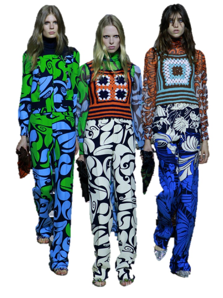
what are your thoughts on this? I wanna like it but i am struggling…:) although i think they could be wearable as separates and a legging and boots.
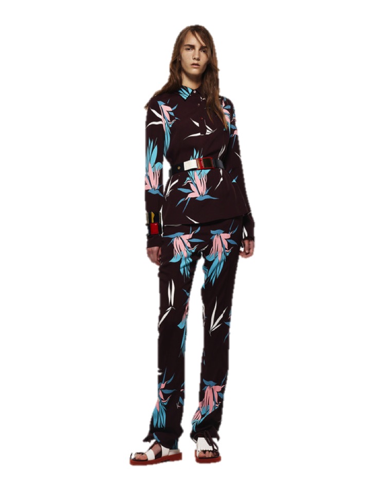
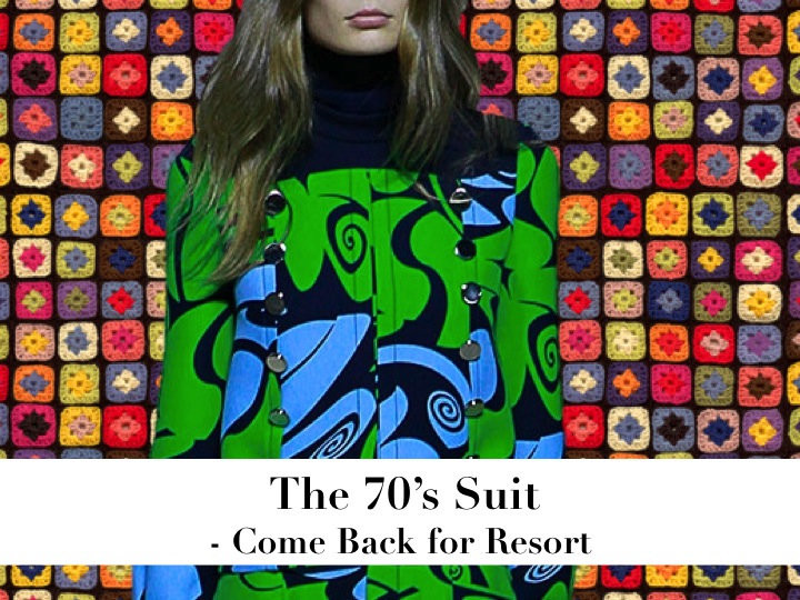
Marni
There are these awkward fashion moments, when ugly and kitsch things come back with a huge boom. Like for example the printed, colourful, so-70’s suits. Covered with flowers, veggies, twirls and other super optimistic patterns, the nightmare of kitsch appears more than once for Resort 2015. The kaleidoscope of loud, proud, floral and psychedelic print pantsuits by Miu Miu, Marni, Louis Vuitton and Mary Katrantzou will try to encourage us, to wear these the next spring. For now, I feel a bit scared. But we must be all brave.

Mary Katrantzou

Louis Vuitton
Miu Miu